Spring signals a verdant design palette
Every spring, Elisa drives around awestruck by the explosion of fresh growth in the valley. Along Teton Pass. Down Snake River Canyon. Everywhere she looks, a riot of green greets her. Thanks to the continued wet weather, the lush profusion has carried into early summer.
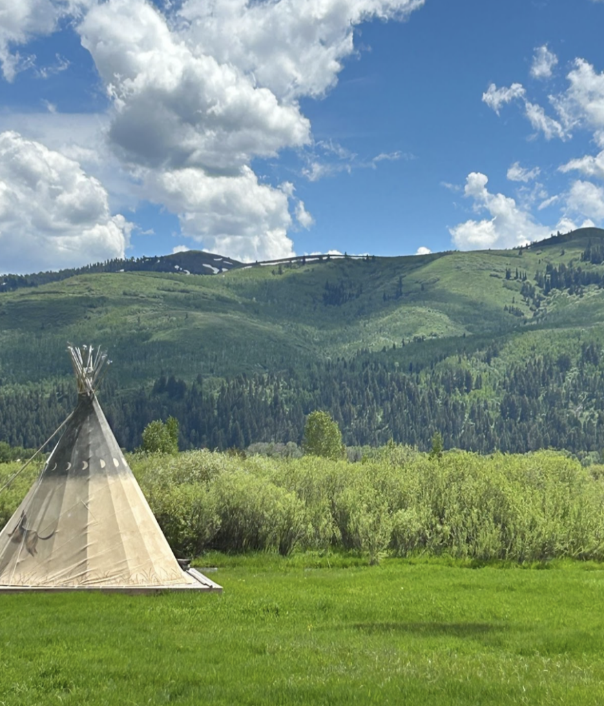
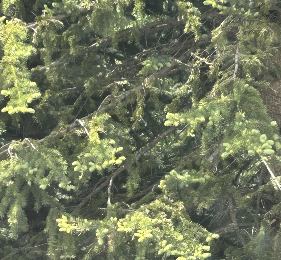
“It’s hard to comprehend how many greens exist in nature: evergreen, brown green, rich blue-green. Even the green of grass looks different when mowed or wild,” Elisa says. “I only think about green in the spring, probably because we are so color-deprived all winter. There is hope and life after a Jackson winter.”
Despite being a self-professed “blue girl,” this verdant profusion has—quietly, subtly—made its way into her interior design. A review of recent projects reveals a bounty of green hues accenting her otherwise neutral aesthetic.
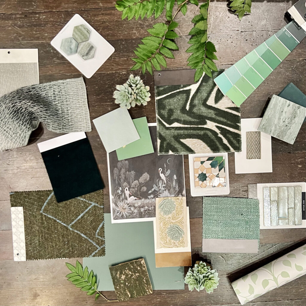
The shades’ names alone speak to their sourcing in nature: citrus, forest, fern, moss, sage, pear, basil, pine, seafoam, kelly, lime, crocodile. Texture and pattern enliven such hues: boldly graphic upholstery feels more grounded in forest; an Ann Sacks mosaic tile feels freshly antique with its verdant tones; an open weave makes a pistachio textile seem less pastel, more organic. By carrying the natural inspiration into her design applications, Elisa makes green moments feel as fresh, as welcome, as spring itself.