Jewel Box Powder Rooms

Elisa approaches tiny toilettes as jewel boxes—small spaces containing enormous potential for expressive style.

Public facing yet free in spirit (untethered design-wise to other rooms), powder rooms present an opportunity to have fun and be bold.

Elisa ensures her clients see such spaces as outlets for expressions. In initial budget conversations, she often begins by outlining her allocation hierarchy by room:  she always advises spending the most on the places where you spend the most time, like the primary suite and the kitchen. Perhaps surprisingly, the powder room rates high for her for high impact. Every other bathroom in a house carries the potential for significant wear and tear (i.e. bathtubs overflowing in kids’ en suites). In contrast, powder rooms often exist in proximity to the highest traffic yet removed from rugged use. As such, spectacular pieces can take centerstage, safely. “The lighting can be drop-dead. You can have fun with wallpaper. You can play with a statement sink,” Elisa says. “Powder rooms are a public space that you want to be beautiful.”

As such, she shares her favorite moments from powder rooms she has designed over the years:

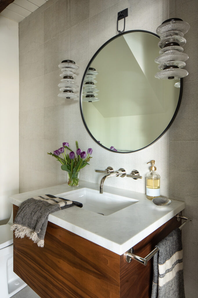
Sculptural pendant lights, threading together stone and glass, add drama to this otherwise classically sophisticated powder. Chrome fixtures provide a clean contrast to the textured drops.

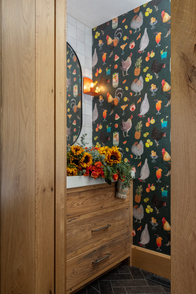
To celebrate the joie de vivre of a family farm, Elisa picked a fun wallpaper for the powder room, aptly (and quite literally) toasting chickens and cocktails. The color play continues with the orange sconce from Urban Electric. Perched beside the laundry room and garage, this riotous nook sets a fun tone for all.  

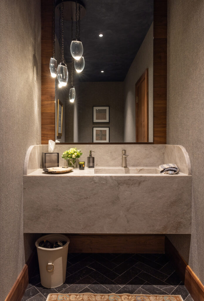
Epitomizing the style spectrum made possible by an expressive approach to powder rooms, a second small loo in the same family farm as above channels a more moody, masculine vibe in keeping with its location off of the husband’s bar. A vanity with gravitas—made of Taj Mahal quartzite—anchors the space, with a cluster of handblown glass pendants as lighting.

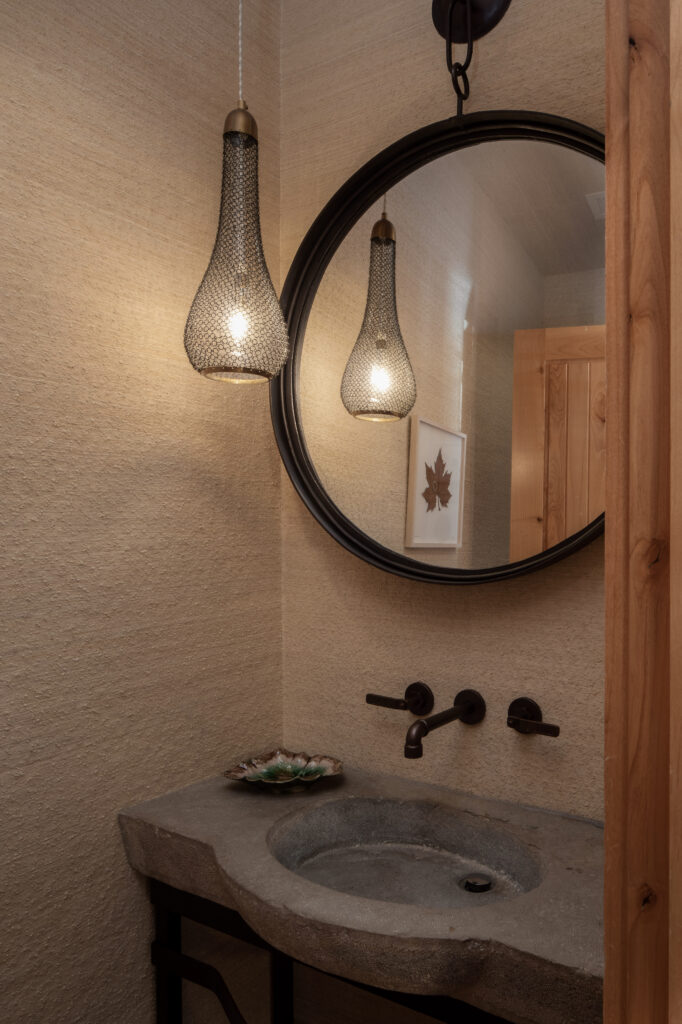
Texture sets the tone in this powder room: grass cloth wallpaper complements the antique sink made of carved stone (atop a custom black metal base) and the classic punctuation of black fixtures.

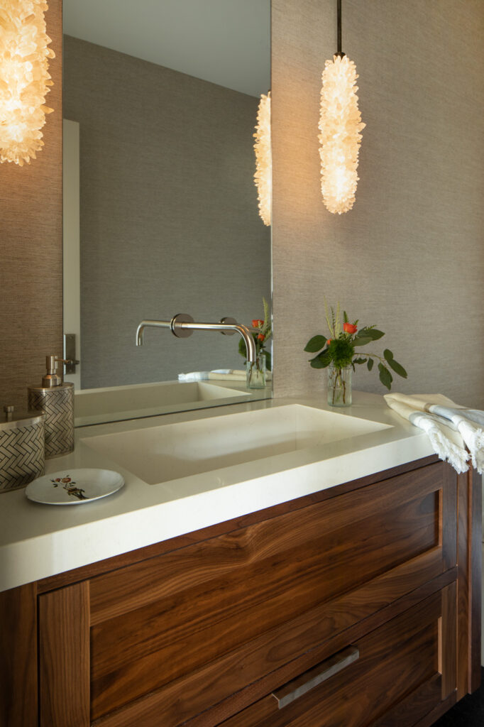
Crystalline pendants from Christopher Boots add an ethereal element amid the elegance set by the lustrous walnut vanity and the subtle grass cloth walls. 

Devil in the Details—Hardware as Crucial, Careful Punctuation

Like punctuation, hardware clarifies the statements made within an interior design story. Like a period at the end of the sentence, cabinet pulls and door knobs represent one of the last decisions made, and yet their presence is fundamental. For Elisa, a kitchen without hardware feels lacking—a missed opportunity to make a tactile connection between people and place. Over the course of a day, everyone in a home interacts with its hardware: grabbing the closet handle at dawn, pulling open a drawer for a coffee spoon, pushing in the front door after a full day. These countless interactions accumulate into a real—if overlooked—relationship with design: the pieces we reach for constantly—their feel, their visual comfort—serve as quiet reminders of care. For instance, the frosted glass door leading into Elisa’s office in the back of Twenty Two Home features a 4-foot-long, 2-inch-round blackened metal handle. A statement piece, its heft lends character and strength to the door, contrasting the soft lightness of the frosted glass. Pushing open the door becomes an affirmation of empowerment, a threshold of layered confidence.

When sourcing hardware for a home, Elisa considers her clients’ preferences and style. Would they rather open a cabinet with a push latch or a pull? What finishes are featured throughout the home? Should flourishes made elsewhere—in the form of statement lighting or decorative accents—be considered in contrast? Or can the hardware act like jewelry, a decorative turn unto itself? Often, Elisa gravitates toward timeless silhouettes, clean in profile yet substantial to touch. Though fundamental, hardware need not be boring; approached as jewelry, the presence of hardware can convey play and personality.

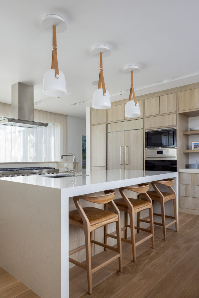
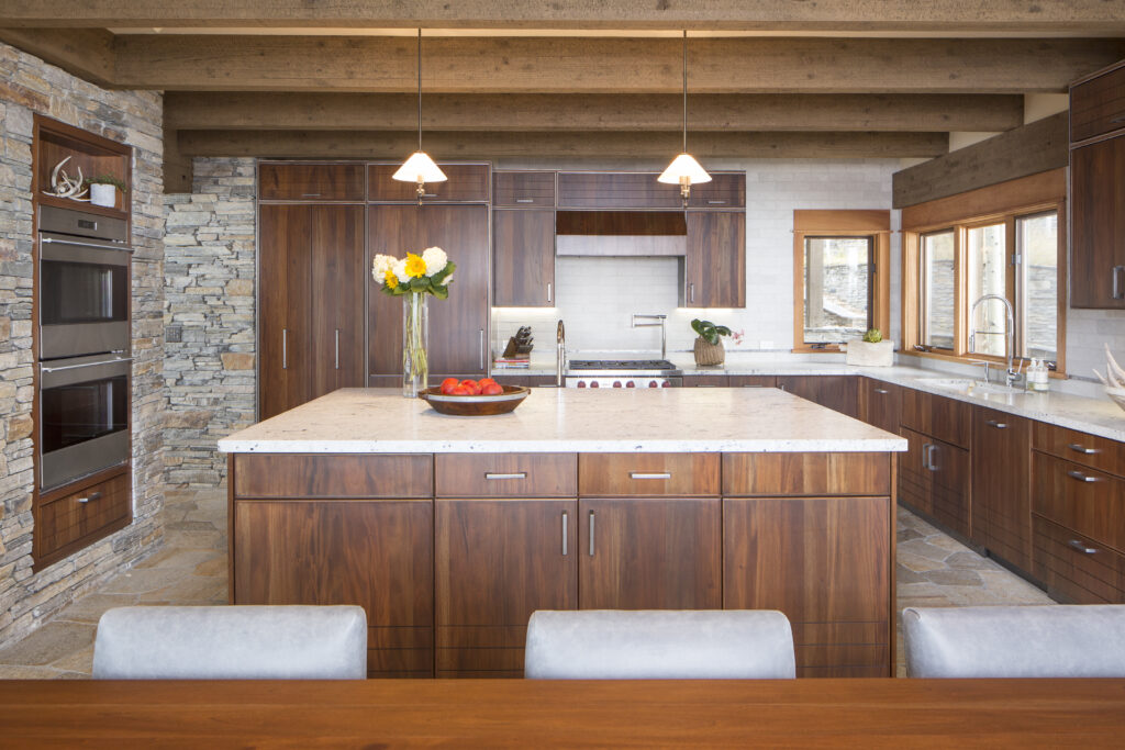
A client’s call for a clean, contemporary kitchen directed the use of push latches in lieu of pulls. Mirroring the modern faucet, angular brushed nickel handles on the paneled refrigerator complement the sleek millwork of the custom cabinetry.

Channeling the layered story made by the Shaker cabinetry within such a modern setting, the drawer pulls strike a traditional note while still embracing sophistication.

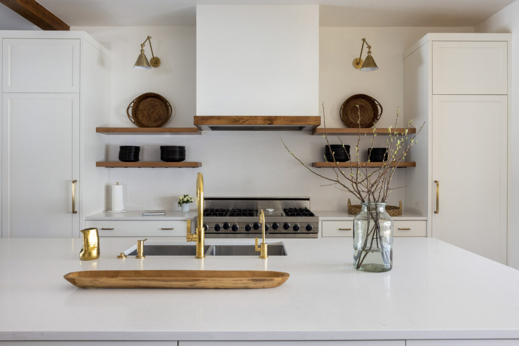
Having chosen brass as the color accent within the white kitchen remodel, rounded brass pulls bridge the distance between the glossy white and natural warmth of the walnut shelving.

Within the richness of the mahogany cabinetry, the brushed-stainless pulls set a light tone in keeping with the accenting stonework.

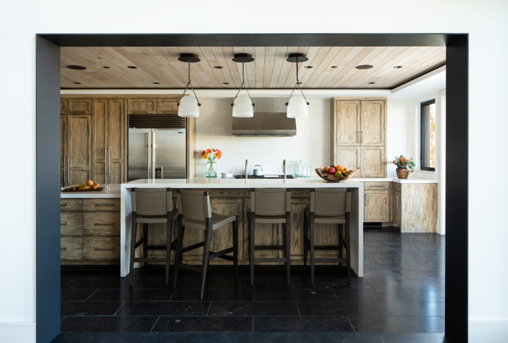
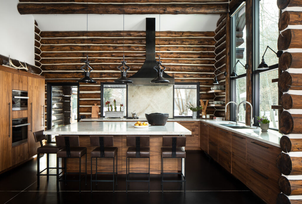
The visual statement made by the logs becomes softened by the flat planes of the millwork and modern style of the expansive stainless steel sink and the industrial pendant lights. As such, oil-rubbed bronze pulls marry the warmth of the wood with the edginess of the accents.

The Green Light of Spring

Spring signals a verdant design palette

Every spring, Elisa drives around awestruck by the explosion of fresh growth in the valley. Along Teton Pass. Down Snake River Canyon. Everywhere she looks, a riot of green greets her. Thanks to the continued wet weather, the lush profusion has carried into early summer.

“It’s hard to comprehend how many greens exist in nature: evergreen, brown green, rich blue-green. Even the green of grass looks different when mowed or wild,” Elisa says. “I only think about green in the spring, probably because we are so color-deprived all winter. There is hope and life after a Jackson winter.”

Despite being a self-professed “blue girl,” this verdant profusion has—quietly, subtly—made its way into her interior design. A review of recent projects reveals a bounty of green hues accenting her otherwise neutral aesthetic.

The shades’ names alone speak to their sourcing in nature: citrus, forest, fern, moss, sage, pear, basil, pine, seafoam, kelly, lime, crocodile. Texture and pattern enliven such hues: boldly graphic upholstery feels more grounded in forest; an Ann Sacks mosaic tile feels freshly antique with its verdant tones; an open weave makes a pistachio textile seem less pastel, more organic. By carrying the natural inspiration into her design applications, Elisa makes green moments feel as fresh, as welcome, as spring itself.